Plotly is the library using which we can generate the interactive graphs which are good visualisation. Using this visualisation we can draw some conclusion or it will make us easy to conclude something by looking at the chart or graphs. In the normal scenario it becomes really difficult to arrive at the decision simply looking at data values.
In this post we are going to learn how to use scatter plot using Plotly library in Python.
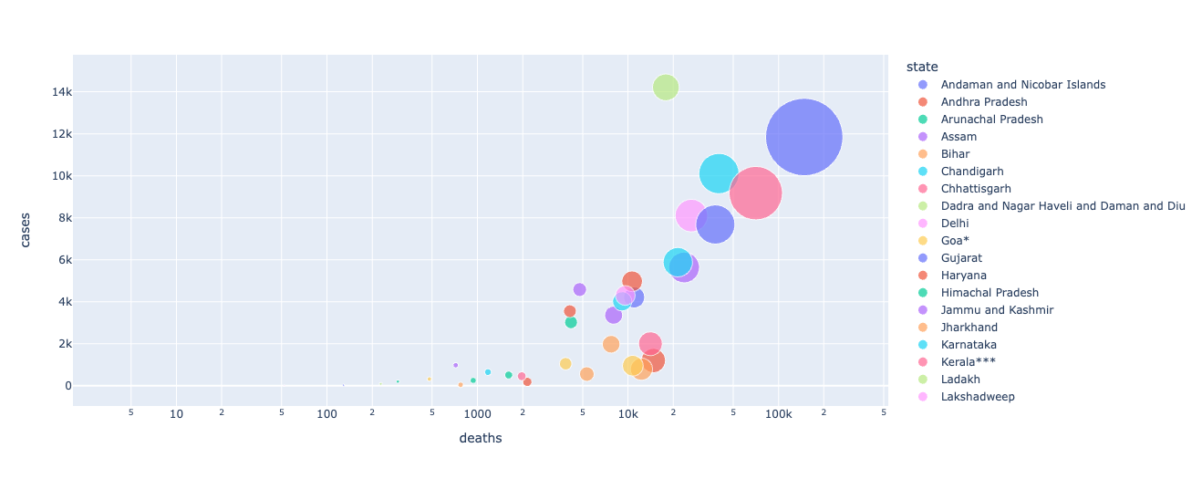
The data points we are going to fetch from the API. Here the API link is “https://covid19-mohfw.herokuapp.com/“. This API is the public API for COVID-19 cases in India, updated directly from MOHFW website. So using this data we are going to plot state wise data for deaths and cases.
In this post we are going to plot bubble chart, which helps to displays multiple circles (bubbles) in a 2D plot as same in scatter plot.
import pandas as pd
import plotly.express as px
import requests

response = requests.get("https://covid19-mohfw.herokuapp.com/")

data=response.json()
df=pd.json_normalize(data['states'])
fig = px.scatter(df, x="deaths",y="cases",size="deaths", color="state",log_x=True, size_max=60)

fig.show()
print(df)
Here is the Output of the above code:
Please check this link for the Jupyter notebook.